This page lists important information for Learnosity customers who are upgrading to the 2022.2.LTS (Long Term Support) version.
On this page:
- Deprecation of Get Activity Base Templates endpoint.
- Removal of the 'change widget type' feature.
- Response masking (
masking_button) now visible by default in some regions.
- Learnosity Design System (LDS) button changes.
- 'Check Answer' button replaced with Learnosity Design System (LDS) button.
Data API
Base Templates have been deprecated, and calling the Get Activity Base Templates end point in Data API will return a deprecation warning in response. You can instead use the Get Activity Custom Templates endpoint in Data API to fetch the custom player templates you may have created using Author API.
Question Editor API
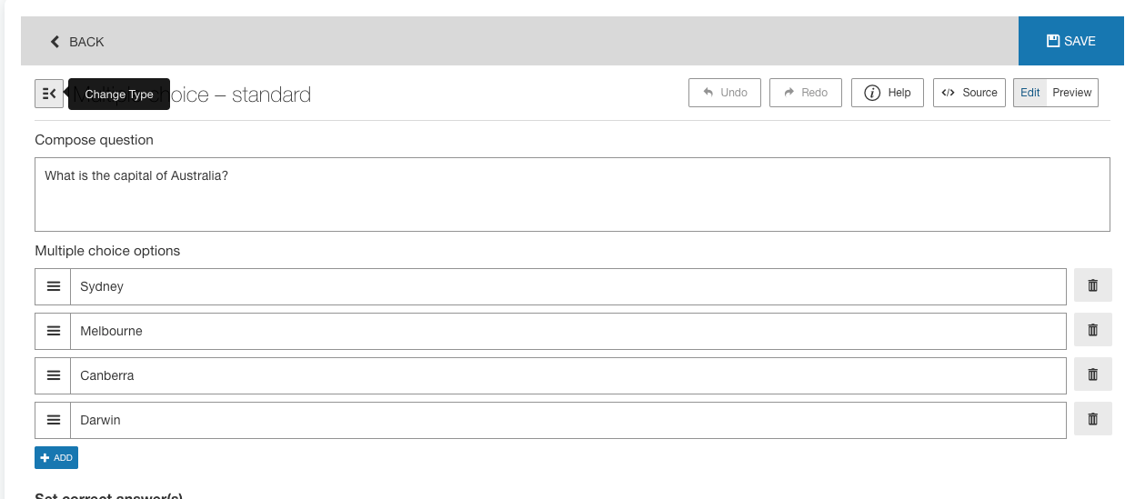
The change widget type feature has been deprecated and removed from the UI. You can still enable it through the change_button init option, but it will show a warning in the browser console. The feature was used to change the type for existing widgets, which in some cases can lead to data corruption by authors as a result of which resumed sessions, scoring and reports could be affected in the following ways:
-
Potential loss of session data where the response format for resumed sessions does not match the expected response format for the changed widget type. (Questions API ignores the response if it does not match the expected format)
-
Potential to break reporting where the response format does not match the expected response format for the changed widget type. This issue affects reports where Questions API is used to see responses. (Questions API ignores the response if it does not match the expected format)

The Change type option in Question Editor
Assess API
The response masking (masking_button) will now be visible in the following default regions: main, horizontal, horizontal-fixed to help more learners benefit from this popular feature to help them through solving Questions. It can be hidden via the "region_overrides" functionality. It can also be controlled through preconfigured template player options on the Author Site.
Author API
Learnosity Design System (LDS) buttons
The following Author API buttons have been replaced by the Learnosity Design System button:
- Item Settings: Reset & Confirm buttons in the Data Table tab
-
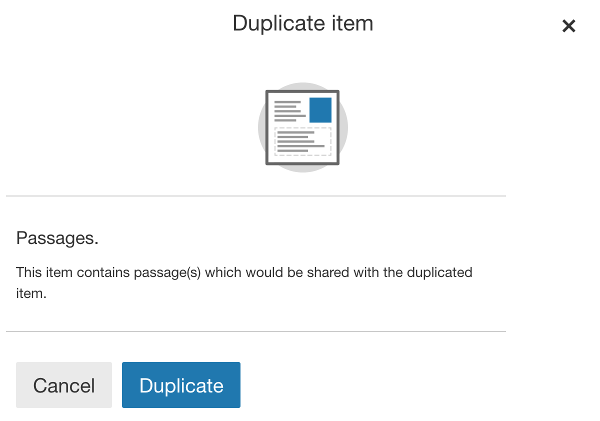
Item Edit: Cancel & Duplicate buttons in the Confirm Item Duplicate prompt
- Activity Edit: Cancel & Duplicate buttons in the Confirm Activity Duplicate prompt
Note that all of the existing button classes and attributes have been maintained on the replaced buttons for backwards compatibility with any existing client CSS selector overrides. In addition to the existing Author API "lrn-btn" & "lrn-btn-<variant>" classes, LDS buttons will have the "lds-btn" and "lds-btn-<variant>" classes.
The list of LDS button class variations used in this replacement are:
"lds-btn-<size>"wheresizecan be:"lg | sm""lds-btn-<variant>"wherevariantcan be:"primary
secondary | outline-dark | outline-danger"
Detailed summary of changes for Cancel & Duplicate buttons in Confirm Item/Activity Duplicate prompt
-
Item Edit: Cancel & Duplicate buttons in the Confirm Item Duplicate prompt
- Activity Edit: Cancel & Duplicate in the Confirm Activity Duplicate prompt
Visual difference
DOM structure diff
<button type="button"
   data-authorapi-selector="message-overlay-button"
   class="lrn-btn lrn-author-btn lrn-btn-lg lrn-btn-primary
   lds-btn lds-btn-primary lds-btn-lg">
   Duplicate
</button>
The same change has been applied to the Cancel & Duplicate in the Confirm Activity Duplicate prompt on the Activity Edit screen.
Updating your own CSS selector overrides
All Author API buttons that have not been replaced have not been updated in any way. This means that your existing CSS overrides will still match them and style them accordingly.
For the buttons that have been replaced by LDS buttons however, depending on how your CSS selectors are written, there is a case where you will need to slightly update the selectors.
If your CSS selector overrides are scoped within an element ID selector, (say #my-app) then there is no need to update your CSS. This is because we have made sure the existing Author API classes are still assigned to the LDS buttons.
Take the below CSS override for example:
#my-app .lrn-author-item-settings .lrn-btn-cancel {
  font-size: 1rem;
}
This selector will successfully override the styles of the Item settings cancel button even after it has been replaced by the LDS button. This is the case for two reasons:
- As mentioned above, we have made sure the existing CSS classes are maintained on the replaced buttons, giving your existing CSS selectors a chance to target them.
- Due the the fact that you are using an element
IDas a scoping selector, your CSS selectors are guaranteed to have a higher specificity than any Author API CSS selector (we do not useIDselectors in our CSS). This is also true even if your CSS is loaded first.
If your CSS selector overrides are not scoped within an element ID selector, but instead you are making sure they contain more classes than the Author API selectors, then you will need to update them so that they can target the LDS buttons.
For example, if your CSS override looks like the following:
.lrn.lrn-author .lrn-author-api-react-container .lrn-author-item-settings .lrn-btn.lrn-btn-cancel {
  font-size: 1rem;
}
You can either simplify it to contain a scoping element ID like so:
#my-app .lrn-author-item-settings .lrn-btn-cancel {
  font-size: 1rem;
}
...or you can bump the selector specificity with an extra "lds-btn" class to be able to target and override the LDS button styles like so:
.lrn.lrn-author .lrn-author-api-react-container .lrn-author-item-settings .lds-btn.lrn-btn.lrn-btn-cancel {
  font-size: 1rem;
}
Notice the extra .lds-btn in the last part of the selector above.
Turning off the LDS buttons in Author API
In the event that migrating to this LTS version proves more challenging due to the Author API button replacement and to help with this initial transition period, we have made a boolean beta flag init option available to use: config.beta_flags.lds. When this is set to false, the flag instructs Author API to render its previous legacy buttons instead of the LDS ones in the entire Author API.
Beware that this is a temporary and/or last resort compatiblity option to give clients time to address any unexpected styling issues, and the flag can be removed in a future LTS version without notice. Developers will be reminded of this with the following warning in their browser's console whenever they set the flag to false:

Questions API
Learnosity Design System (LDS) check answer button
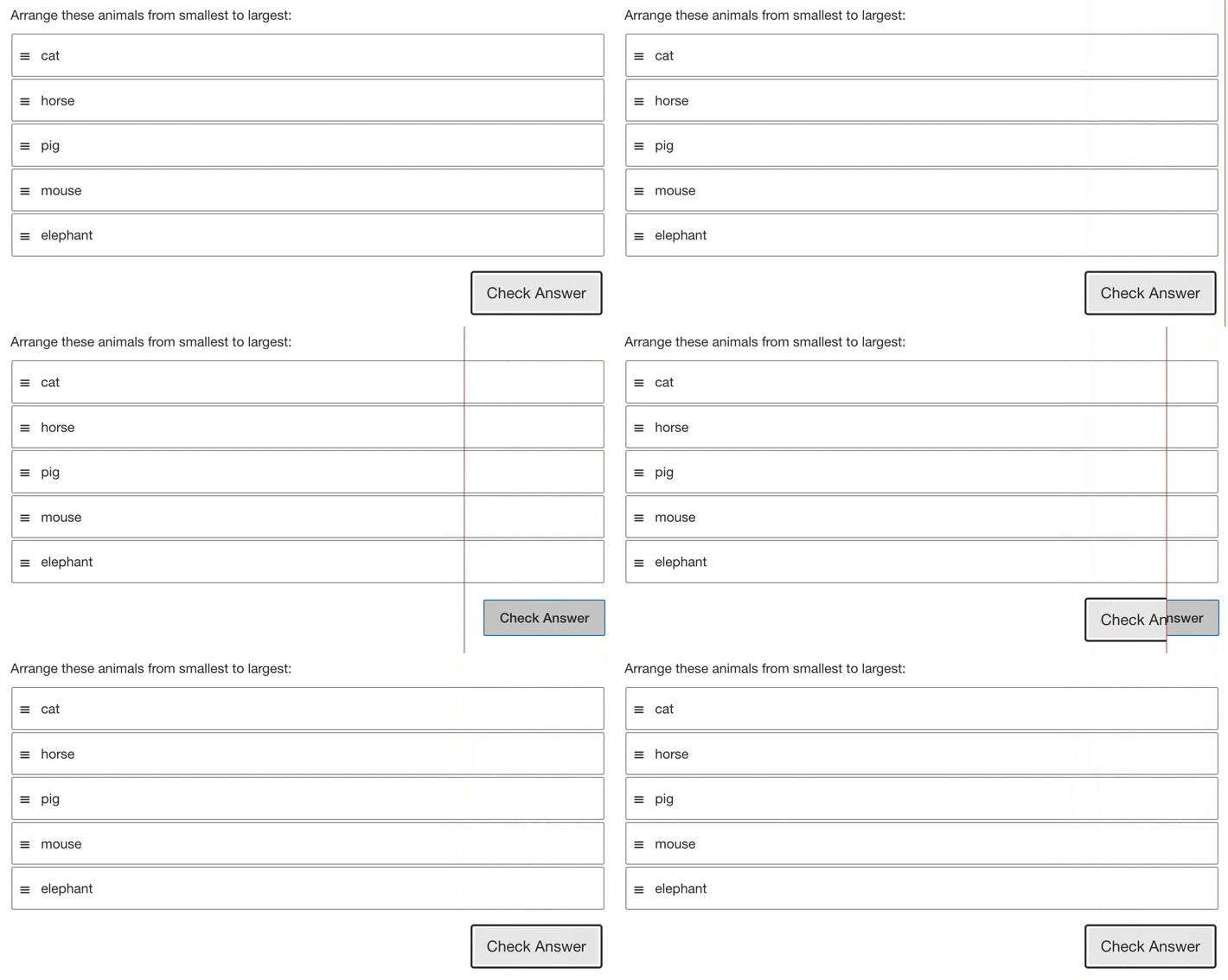
The Check Answer button has been replaced by the Learnosity Design System (LDS) button. The new button will have an additional two classes, namely lds-btn and lds-btn-secondary. In visual changes it has rounded corners in normal state while in focus state the button will have a black outline border.
Visual difference

To the left of the drag bar is the new UI with the updated components, on the right is the previous (non design system buttons).
DOM structure diff
<button type="button"
   class="lds-btn lds-btn-secondary
   lrn_btn lrn_validate">
    <span>Check Answer</span>
</button>
Updating your own CSS selector overrides
The Check Answer button has been replaced by LDS buttons however, depending on how your CSS selectors are written, there is a case where you will need to slightly update the selectors. If your CSS selector overrides are scoped within an element ID selector, (say #my-app) then there is no need to update your CSS. This is because we have made sure the existing Questions API classes are still assigned to the LDS button. Take the below CSS override for example:
#my-app .lrn_btn .lrn_validate {
 font-size: 1rem;
}
This selector will successfully override the styles of the check answer button even after it has been replaced by the LDS button. This is the case for two reasons:
- As mentioned above, we have made sure the existing CSS classes are maintained on the replaced buttons, giving your existing CSS selectors a chance to target them.
- Due the fact that you are using an element ID as a scoping selector, your CSS selectors are guaranteed to have a higher specificity than any Questions API CSS selector (we do not use ID selectors in our CSS). This is also true even if your CSS is loaded first.
If your CSS selector overrides are not scoped within an element ID selector, but instead you are making sure they contain more classes than the Questions API selectors, then you will need to update them so that they can target the LDS buttons.
For example, if your CSS override looks like the following:
.lrn.lrn-assess .lrn_question .lrn_response_wrapper .lrn_btn .lrn_validate {
 font-size: 1rem;
}
You can either simplify it to contain a scoping element ID like so:
#my-app .lrn_btn .lrn_validate {
 font-size: 1rem;
}
...or you can bump the selector specificity with an extra "lds-btn" class to be able to target and override the LDS button styles like so:
.lrn.lrn-assess .lrn_question .lrn_response_wrapper .lds-btn .lds-btn-secondary .lrn_btn .lrn_validate {
 font-size: 1rem;
}
Notice the extra .lds-btn .lds-btn-secondary in the last part of the selector above.
Turning off the LDS buttons in Questions API
Note that the Check Answer button classes and attributes have been maintained for backwards compatibility with any existing client CSS selector overrides. To disregard the LDS replacement to the button, you can use the `beta_flags` to disable the LDS replacement.
{
  "beta_flags":{
    "lds": false
  }
}
UI Improvements
Below is a summary of all CSS changes between the previous LTS release and this release. Generally, these changes contain new feature implementations and various accessibility improvements.
See all CSS changes between v2022.1.LTS and v2022.2.LTS in GitHub
Author API
- Implemented our new Learnosity Design System buttons to replace existing buttons
- Added new styling for aria-labels in Question Edit view
- Various accessibility color contrast improvements
- Upgraded CKEditor
- Improved audit trail
- Removed unused CSS rules
Question Editor API
- Updated tooltips and ARIA labels for various form components
- Fixed incorrect validation response borders when using right-to-left mode
Questions API
- Upgraded internal Webpack library, improving performance, reducing file size and optimising the output of the CSS files
- Fixed a bug with screen readers where borderless tables were not being read
- Updated Line Reader styling
- Fixed accessibility focus bugs with the Audio player and improve color contrast
- Updated internal Learnosity Design System package and apply new elements to the Check Answer buttons
- Updated MCQ styles to improve accessibility
- Fixed tokenhighlight borders being cut off when used in a sharedpassage
- Improved the calculator drag-drop handle styling
- Updated help modal for the formula keypad and improved the accessibility of the close button
Reports API
- Improved the score circle in the session-detail-by-question report so that scores are no longer cut off
