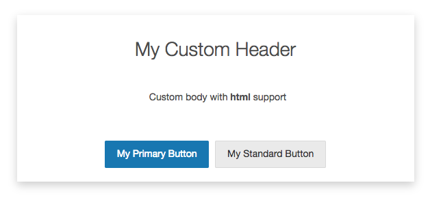
Create customizable dialogs using the Items API.
Overview
Custom dialogs can be used to display messages to users during their assessment. The following settings can be customized:
- Heading,
- Body text, and
- Any number of buttons which can be displayed as a standard or primary focus button.

Launching the Custom Dialog
The custom dialog can be launched after the assessment has been started by accessing the dialogs public method.
Any number of buttons can be specified and will be rendered in the order they are provided. When no buttons are added, a default "Continue" button will be rendered and will dismiss the custom dialog when clicked.
// initialize the Items app
const itemsApp = LearnosityItems.init(...);

// show the custom dialog
itemsApp.assessApp().dialogs().custom.show({
    "header": "My Custom Header",
    "body": "Custom body with <strong>html</strong> support",
    "buttons": [
        {
            "button_id": "my_primary_button",
            "label": "My Primary Button",
            "is_primary": true
        },
        {
            "button_id": "my_standard_button",
            "label": "My Standard Button",
            "is_primary": false
        }
    ]
});

// dismiss the custom dialog
itemsApp.assessApp().dialogs().custom.hide();