Author API is built to be responsive within its container dimensions, to smoothly adjust to various screen shapes and sizes on a range of devices. The user interface automatically responds to the initial container size as well as resize events to make use of the available screen space.
The user interface breakpoints (size boundaries that trigger a change in the information display) are designed for a large width of 1170px and above, a medium width of 800-1169px, a small width of 615-799px, and an extra small width of 614px and below. The examples below demonstrate the changes at each breakpoint.
Item list view breakpoints
Large, width >= 1170px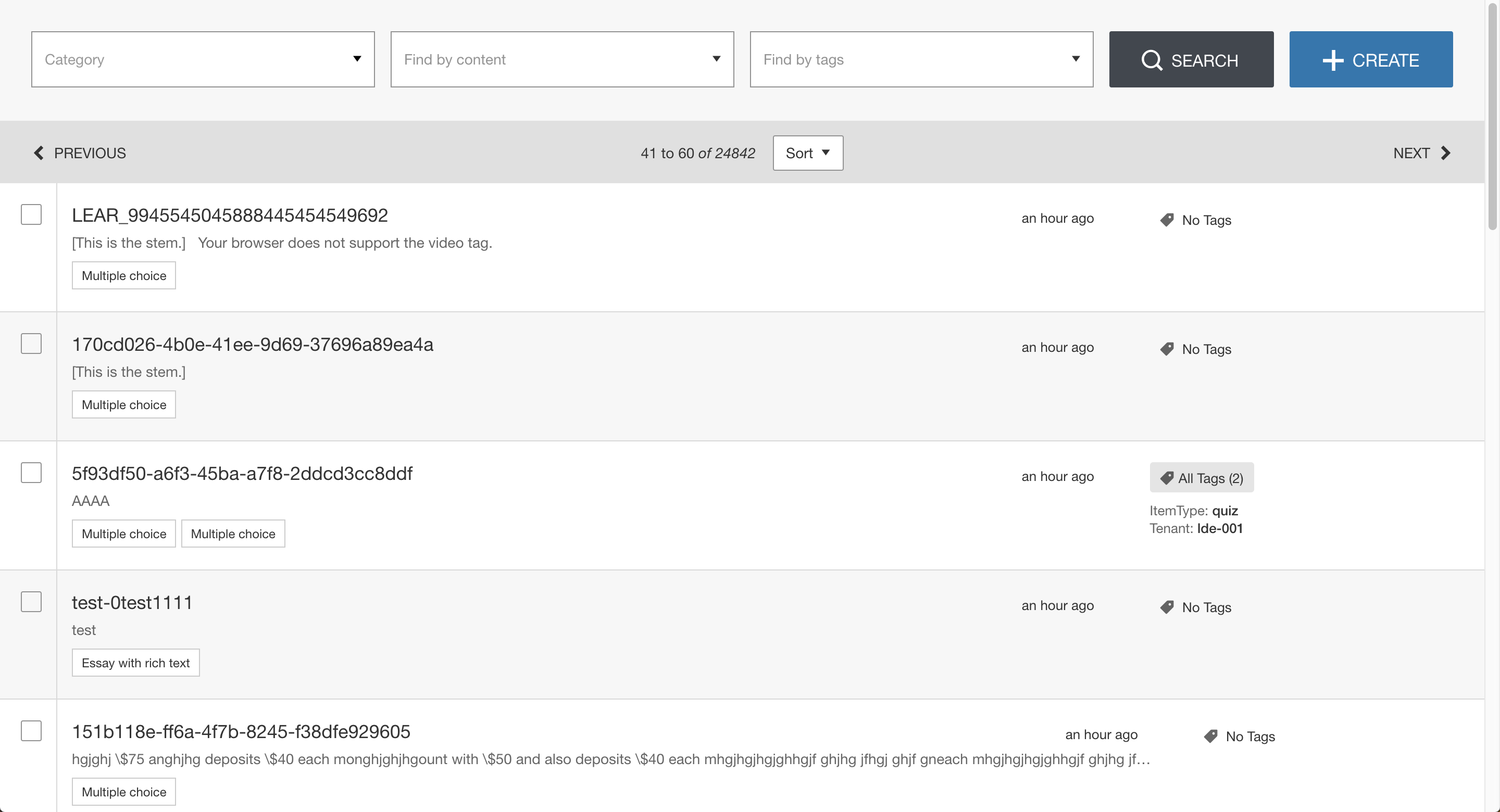 |
|
|---|---|
Medium, width 800-1169px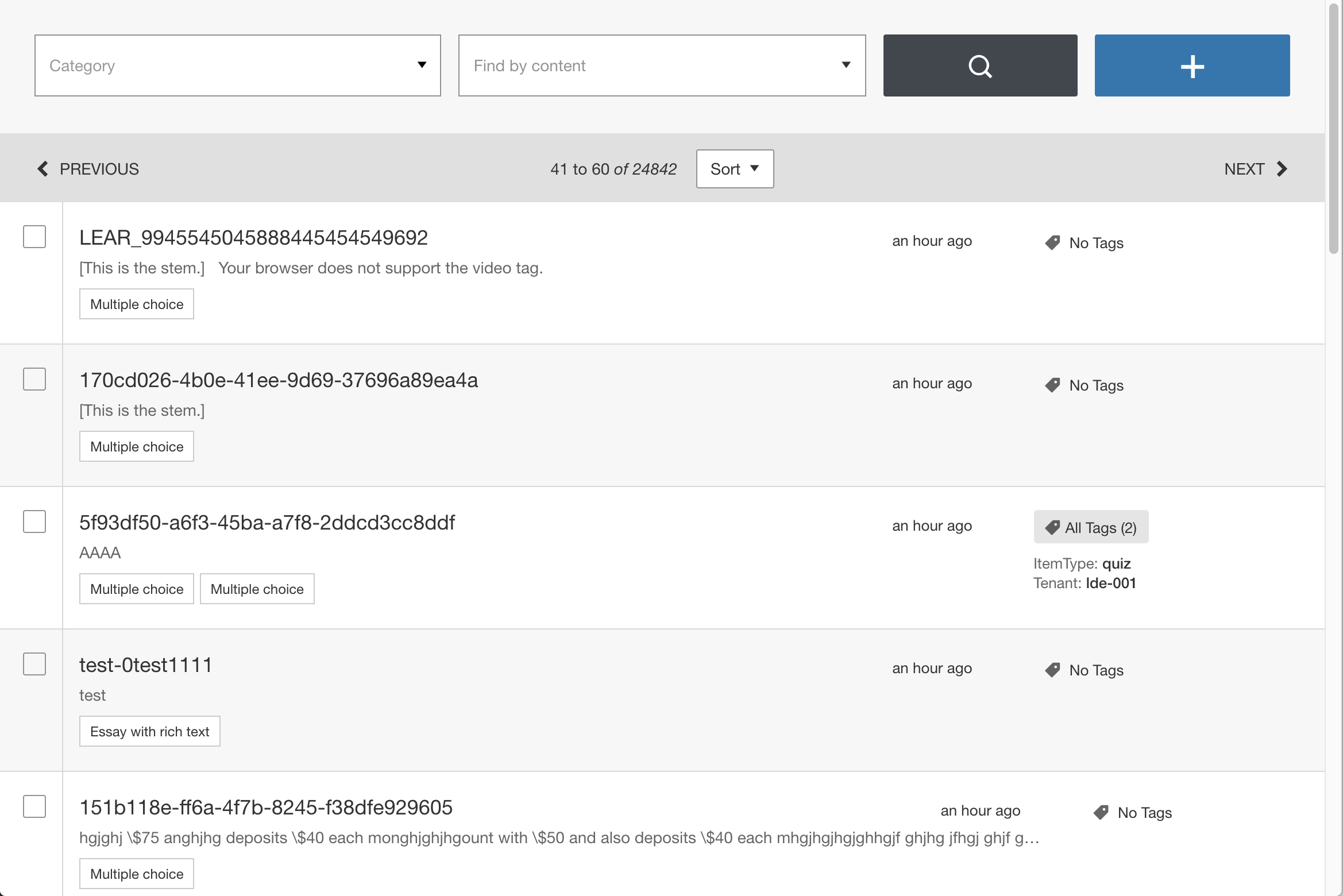 |
|
Small, width 615-799px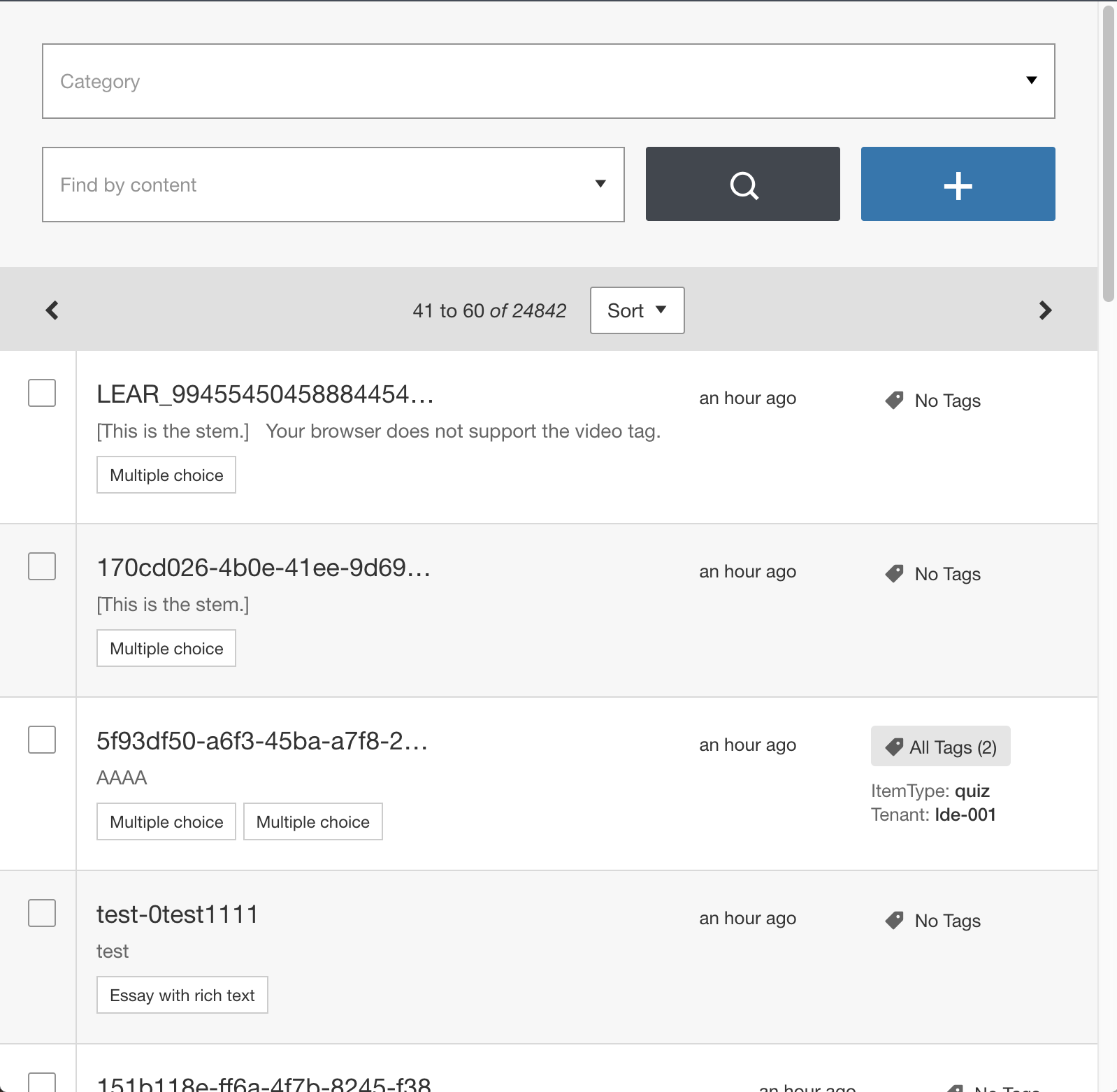 |
|
Extra Small, width <= 614px |
|
Item edit view breakpoints
Large, width >= 1170px |
|
|---|---|
Medium, width 800-1169px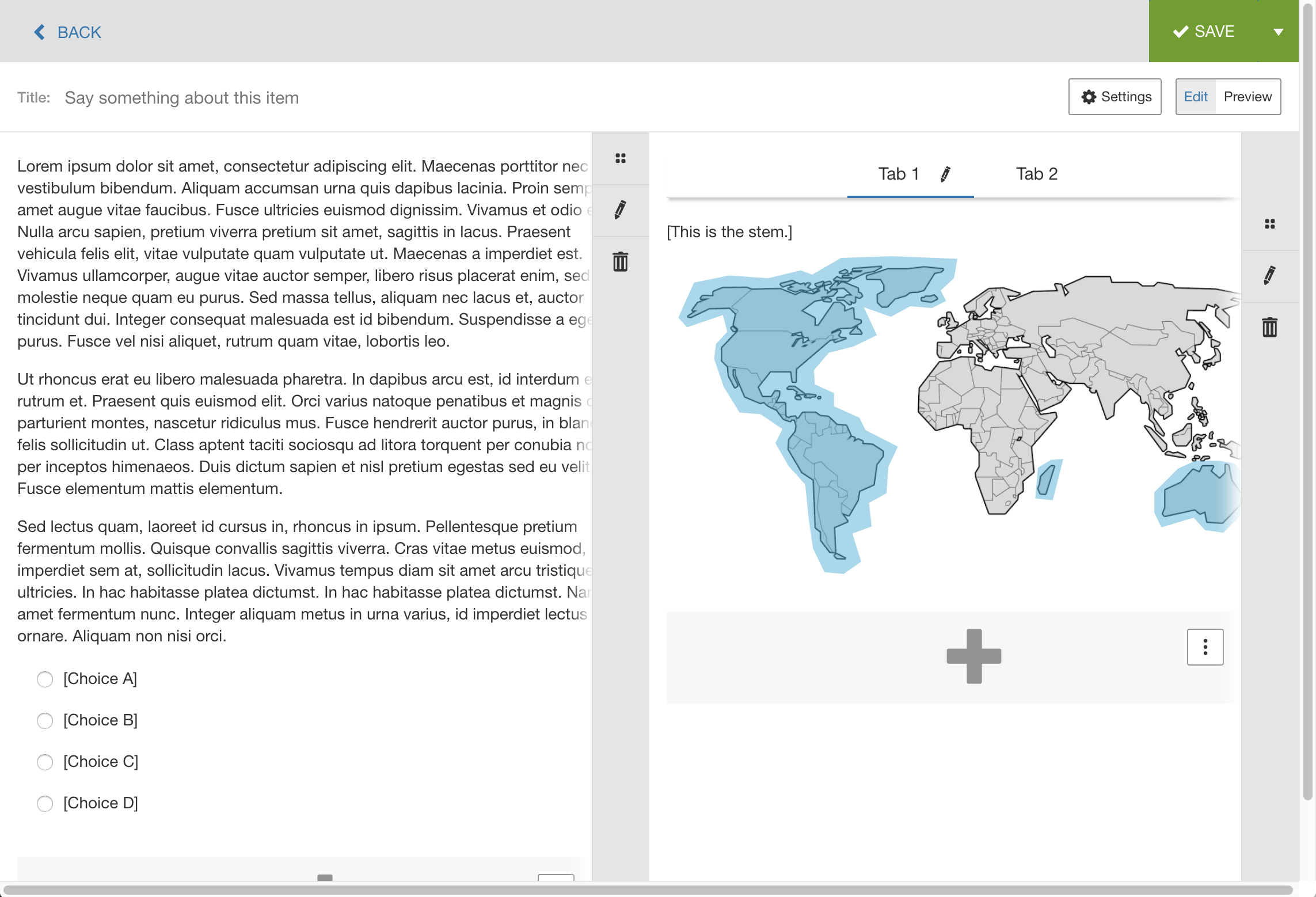 |
|
Small, width 615-799px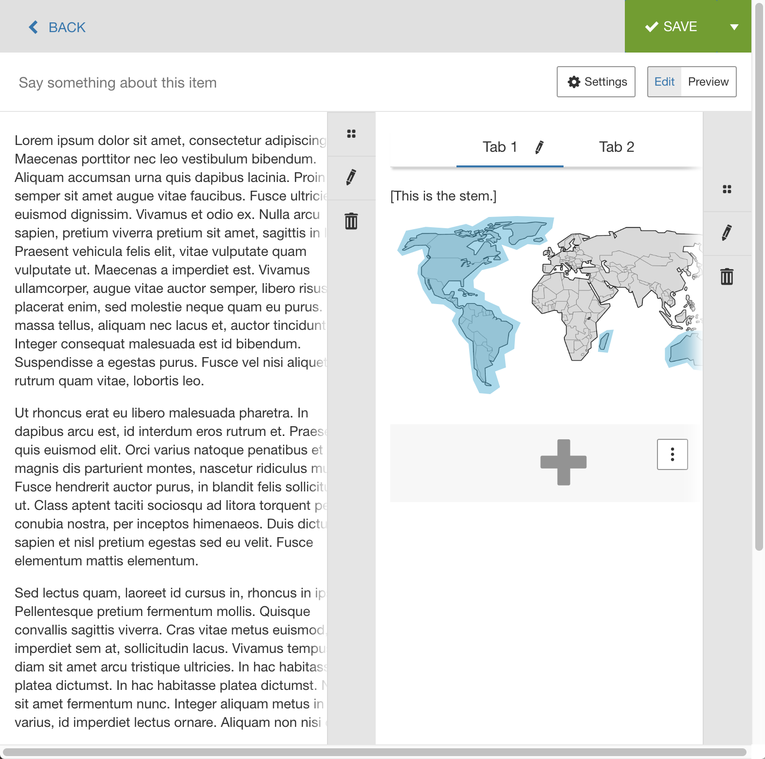 |
|
Extra Small, width <= 614px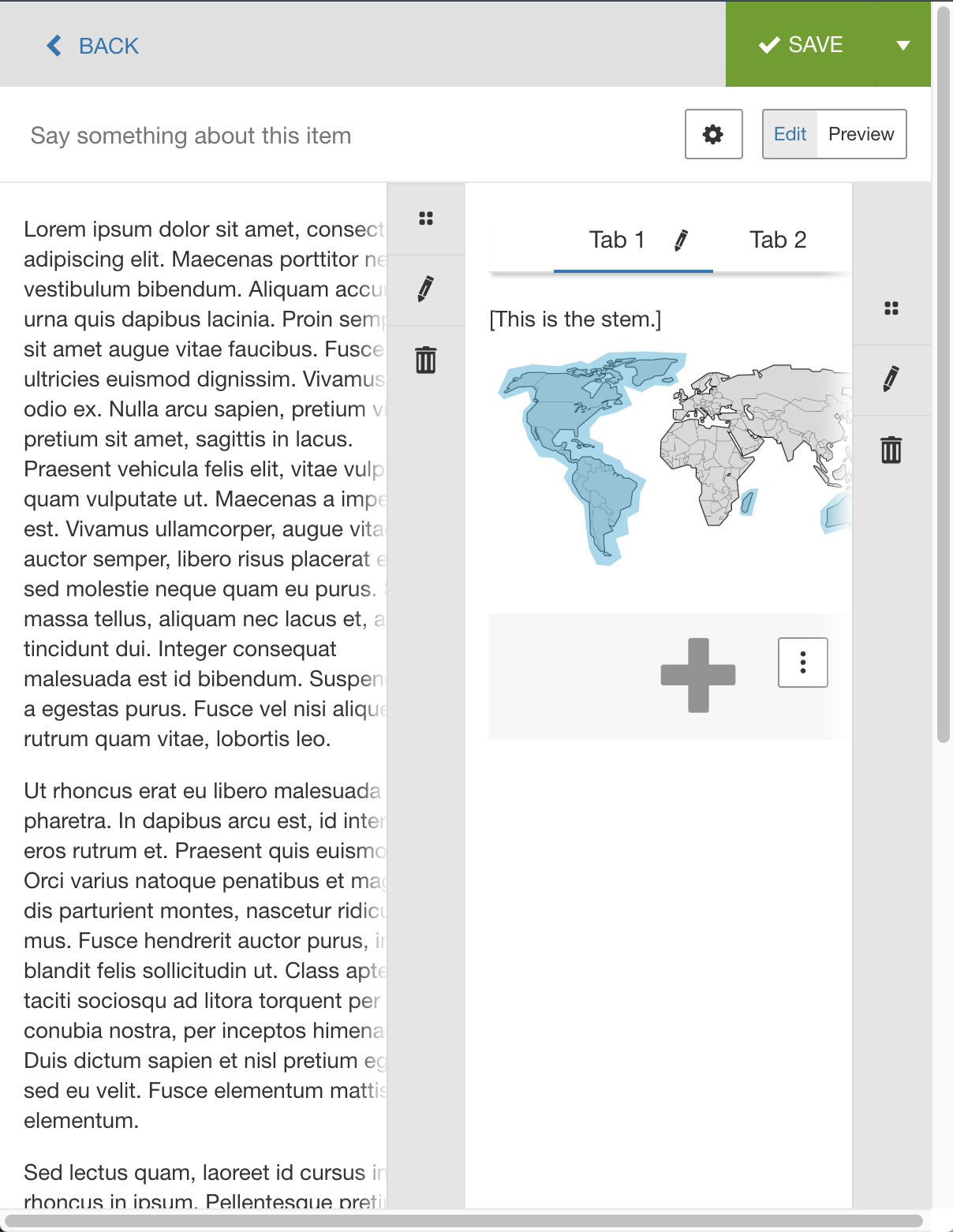 |
|